rem方案实现页面宽高自适应
问题引入及解决
最近做大屏项目,有一个现实问题:不同屏幕如何保证页面按 16:9 显示。
由于不同设备屏幕尺寸、分辨率不同,或者需要考虑横竖屏问题,为了使得web页面在不同移动设备上具有相适应的展示效果,需要在开发过程中使用合理的适配方案来解决这个问题。
rem方案提供了较好的解决办法:
根据页面宽高比16:9,
- 当设备较宽时,w设备/h设备 > 16/9,此时页面高度即为设备高度
- 当设备较高时,w设备/h设备 <= 16/9,此时页面宽度就是设备宽度
因此,有如下计算方法:
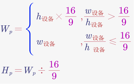
其中,Wp 为页面有效宽度,Hp 为页面有效高度
页面左右居中,上下居中,四周留白即可
然后,在
中设置字体按比例缩放 1rem = W / 100 ,即可达到效果。
代码实现
index.html
1
2
3
4
5
6
7
8
9
10
11
12
13
14
15
16
17
18
19
20
21
22
23
24
25
26
27
28
29
30
31
32
33
| <head>
<script>
const clientWidth = document.documentElement.clientWidth;
const clientHeight = document.documentElement.clientHeight;
const pageWidth = clientWidth / clientHeight > 16 / 9 ? clientHeight * 16 / 9 : clientWidth;
const pageHeight = pageWidth * 9 / 16;
const string = `
<style>
html{
font-size: ${pageWidth / 100}px;
}
</style>
`;
document.write(string);
</script>
</head>
<body>
<div id="root"></div>
<script>
root.style.width = pageWidth + "px";
root.style.height = pageHeight + "px";
root.style.background = "pink";
root.style.marginTop = (clientHeight - pageHeight) / 2 + "px";
root.style.marginLeft = "auto";
root.style.marginRight = "auto";
</script>
</body>
|
使用 rem 代替 px
当使用宽高自适应响应式布局之后,就不能使用 px 单位将每个元素尺寸写死了,此时就需要用 rem 来计算元素的尺寸。
根据页面与设计稿的尺寸与宽度之比相等,可知:
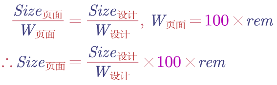
因此,页面尺寸只需通过如下px函数就能计算得到:
| @function px($n) {
@return $n / widthDesign * 100rem;
}
|
其中,$n 为设计稿实际尺寸;
常量 widthDesign 为设计稿实际宽度,由实际测量得到。